Phone Case Colour Matching: How to Pick a Shade That Works
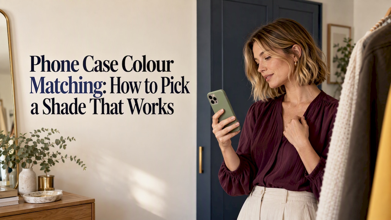
The easiest way to match a phone case to your outfit is to treat it like an accessory with a job. Either it quietly repeats a colour you already wear, or it adds one deliberate accent. Neutrals work with almost everything. Bold shades work best when the rest of your look is calm. Below you’ll find a simple system, worked combinations, this year’s trends and the practical checks that stop a good-looking case becoming a regret.
TL;DR
- Pick one role for your case: a base that blends with your wardrobe, or an accent that adds a single pop of colour.
- If you wear mostly neutrals, almost any colour works as the accent. If you wear lots of colour, stay neutral or tonal.
- Work out whether your wardrobe leans cool (blue-based) or warm (yellow-based) and choose a case from the same family.
- In 2026, warm whites, soft pastels and sorbet shades are the colours Australian fashion media keep pointing to.
- Check how the colour sits against your phone’s own finish, and how it will look after months in a bag and a back pocket.
Table of Contents
- Start with the job your case does in your outfit
- A simple rule that works: 60-30-10
- Find your colour family: cool, warm or neutral
- Colour combinations that are easy to coordinate
- Colour ideas by style and occasion
- What’s trending in Australia in 2026
- Match the case to your phone, not just your clothes
- A quick method for choosing in five minutes
- Build a coordinated set, not just a case
- Perspective
- Shop colours that coordinate
- FAQ
- Sources
Start with the job your case does in your outfit
Most colour-matching advice fails because it starts with a colour wheel. Start with a question instead: should people notice the case, or should it disappear?
There are two sensible answers.
The case as a base. It matches the dominant colours in your wardrobe, so it looks right with nearly everything. Black, cream, stone, tan, navy and clear-toned neutrals live here. You’ll never think about it in the morning, which is the point.
The case as an accent. It’s the one small, deliberate burst of colour in an otherwise calm outfit. Think a butter yellow case with a grey knit and jeans, or a cherry red case with an all-black work outfit.
The phone is something you hold and put down on tables all day, so it’s one of the most visible accessories you own. It’s also small. That’s why it can carry a stronger colour than a jacket or a pair of trousers can.
A simple rule that works: 60-30-10

Stylists often use the 60–30–10 rule: 60% of an outfit in a base colour, 30% in a secondary colour and 10% in an accent. It translates neatly to your phone case.
Your case is almost always in that 10%. So the question becomes: which colour would make a good accent for what I wear most?
| Your wardrobe is mostly | Your 60% and 30% | A case that works as the 10% |
|---|---|---|
| Black, grey and white | Monochrome | Any single bright: red, cobalt, lime, hot pink |
| Denim and white tees | Blue and off-white | Tan, butter yellow, tomato red, sage |
| Earthy tones (olive, rust, camel) | Warm neutrals | Cream, chocolate, terracotta, soft pink |
| Navy and tailoring | Cool, structured | Pale blue, blush, burgundy |
| Bright prints and colour | Busy | Black, white or a tonal neutral |
| Pastels and soft tones | Light, low contrast | Lilac, mint, cloud white, a slightly deeper pastel |
If you swap outfits constantly, don’t try to match each one. Choose a case that works as an accent with your top two or three colour families. That covers most days.
Find your colour family: cool, warm or neutral
Australian stylist Fiona Keary suggests working within a colour palette that suits you so that the pieces in your wardrobe mix and match. She describes cool colours as blue-based and warm colours as yellow-based, and notes that for people who sit in the middle, depth or intensity can matter more than temperature.
You can use that for a phone case in a few minutes.
- Lay out five or six things you wear most: tops, a jacket, a bag.
- Sort them by undertone. Navy, grey, emerald, berry and icy pastels lean cool. Cream, camel, olive, rust and mustard lean warm.
- Choose a case from the larger pile.
A cool wardrobe suits cool-toned cases: lavender, powder blue, silver-grey, cherry red with a blue tinge. A warm wardrobe suits butter, caramel, terracotta, sage and peach. If your wardrobe is split, choose a neutral on the edge, such as a soft off-white or a deep chocolate, and it will sit comfortably either side.
The same logic of undertone matters well beyond fashion. Any time you’re matching one shade to another, from clothing to colour matching in beauty and hair, the undertone decides whether the result looks natural or slightly off.
If you’re “in between”
Fiona Keary’s point about intensity is handy here. If you can’t say whether you’re warm or cool, ask whether you wear mostly light, soft colours or deep, saturated ones. Match the case to that. A soft person in a hot neon case may feel the case is shouting. A person who wears deep, rich colours may find a pale pastel looks washed out beside their clothes.
Colour combinations that are easy to coordinate
These pairings take no real effort, because they rely on contrast or harmony that already works in clothing.
Neutrals for every outfit
Black, cream, stone and tan will not clash with anything. If you want one case to last through a changing wardrobe, this is the safe bet. Cream and tan read softer than black, which can look severe against light summer clothes.
One bright against neutrals
Australian fashion lecturer Thea Basiliou says she tends to wear light neutrals with colour accents, and she places equal value on accessories and clothing. A coloured phone case is exactly that kind of accent. White tee, blue jeans, cobalt case. Grey marle set, tomato red case. It’s the lowest-risk way to use a strong colour.
Tonal dressing
Match your case to your outfit in a deeper or lighter version of the same colour. A sage case with an olive jacket, or a pale pink case with a rose knit, looks considered and calm. Tonal works best when the shades are clearly different. A near-miss, like a navy case against black trousers, can look like a mistake.
Complementary pops
Opposite colours make each other look more vivid: orange with blue, purple with yellow, red with green. Use it sparingly. A lilac case with a mustard cardigan is plenty.
Matching the little things
People often match the case to a bag or shoes. It’s more forgiving to echo something small and repeated: your watch strap, your jewellery metals, a stripe in a scarf. Australian creative Ana Piteira likes comfortable staples and adds a hero piece such as a great shoe or stacked jewellery to feel put together. Your case can be that hero piece on a quiet day.
Colour ideas by style and occasion
Here’s how the idea of a “colour” shifts depending on how you live.
Minimal and workwear. Cream, taupe, charcoal, stone, deep navy. If your office is quiet and your outfits are structured, a neutral case with a soft finish looks polished. Add colour through a ring holder or strap instead.
Uni and everyday casual. Pastels, sage, butter, baby blue and cherry red keep things fresh and cheerful with jeans and hoodies, and they show up well in a lecture theatre full of black cases.
Going out. Gloss black, chrome, deep burgundy or a bold pink go well with evening outfits, which tend to be darker and more dramatic.
Summer and the beach. Sorbet shades, sea greens and sunny yellows suit the season and the light. Pale cases can stain or scuff in a sandy bag, so think about how you’ll use it.
Gifts. If you don’t know someone’s wardrobe, go for a soft neutral or a colour you’ve seen them wear often. Our phone accessories gift ideas cover more choices at different budgets.
Expressing mood. Melbourne-based creator Muskan Sharma says colour reflects her mood, energy and individuality, using intentional colour pops while keeping practical outfits personal. If that’s your approach, pick the colour you like looking at, and let the outfit rules be a guide rather than a law.
What’s trending in Australia in 2026
Trends are useful as a nudge, not a rulebook. Here’s what Australian outlets are pointing at this year.
- Warm and neutral whites. ABC News reported that Pantone chose Cloud Dancer, a billowy white, as its 2026 Colour of the Year, and described a shift toward warm and neutral whites along with neutral pastels such as soft greens and pinks. On a phone case, that means creamy off-white, ivory and milk tones.
- Sorbet and acid lemon. ELLE Australia’s 2026 fashion forecast names sorbet colours, vintage prints, acid lemon and colour blocking among the year’s style directions. Think peach, melon and pale lemon, or two flat blocks of colour on one case.
White and pale cases look wonderful with the right outfit, but they show wear faster, so decide how much that matters to you. Trend colours also date. If you’re keeping the same case for a year or more, choose one that still looks good once the trend has moved on, and use trend shades for add-ons you can swap easily.
Match the case to your phone, not just your clothes
Your outfit changes daily. Your phone doesn’t. Check these before you decide.
Your phone’s finish
If your phone has a bold colour and your case is clear or has cut-outs around the camera, the phone colour shows through. Make sure the two get along. A case in a solid colour hides the phone completely, which makes it easier to match to your clothes.

The camera and the edges
Dark cases make dark camera rings disappear. Light cases make them stand out. Neither is wrong, but it’s worth picturing the back of your phone as a whole.
Glossy, matte or soft-touch
The same colour looks different in each finish. Matte tends to look richer and hides fingerprints. Gloss reads brighter and shows smudges. If you’re unsure which suits you, our guide to phone case materials explains what each one does.
Real wear
White, pale pink and light tan show scuffs and pocket dye transfer from dark denim. Mid-tones such as sage, taupe, terracotta and denim blue hide everyday marks best. Pick the colour you’ll still love in six months.
Don’t let colour override protection
A beautiful case that doesn’t protect your phone isn’t a bargain. When reviewers test cases properly, they use repeated drops and magnetic strength checks. MobileReviews Eh, for example, describes a method using 30 or more drops per case and multiple impact metrics. Look for the same substance in any case you buy: real drop protection, raised edges around the screen and camera, and a fit made for your exact model. Our guide on choosing a case that fits your phone and style walks through it.
A quick method for choosing in five minutes
- Name the job. Base or accent?
- Check your wardrobe. Which two or three colour families come up most?
- Pick the temperature. Cool, warm or neutral, and light or deep.
- Choose the finish. Matte for richness, gloss for brightness.
- Test it against a real outfit. Hold your top choice up next to the clothes you wear most, in daylight if you can.
- Think about the extras. A strap, ring holder or wallet can carry a second colour without changing the case.
If two colours tie, choose the one that makes you smile when you pick up your phone. You see it far more often than anyone else does.
Build a coordinated set, not just a case
Colour matching gets easier when everything you carry agrees with itself. A phone case, a MagSafe wallet and an AirPods case in related shades look like a deliberate set. That doesn’t mean identical. Aim for one shared colour, or one neutral running through every piece, with a single accent.
For example, a cream case with a tan wallet and a soft pink ring holder. Or a black case with a bright strap and an AirPods case in the same bright. Our guide to personalising a phone case without losing protection has more ideas for making a case feel like yours.
Perspective
We make phone cases in limited runs, so colour is the first thing we think about, and the thing we think about longest. What we’ve learned is that people rarely want a case that matches everything. They want one that feels like them and doesn’t fight what they wear.
That’s why we design colourways in families. Our neutrals are there for people who want an easy base. Our brighter and softer shades are meant to be the single accent in an outfit. And because the accessories come in coordinating shades, you can build a set without everything looking identical.
Style is only half of it. Our cases are designed with dual-layer protection, because a colour you love is only worth having if the phone underneath survives a drop. We’d rather you choose a shade you’ll still enjoy next year than chase one that will date, and limited runs mean the case you choose is less likely to be the one everyone else has.
Josua
Shop colours that coordinate
If you’ve settled on a base or an accent, you can browse our full range of MONTE phone cases, priced at $79, in designs and colourways made in limited runs for iPhone, Samsung and Pixel. They’re built with dual-layer drop protection, so the colour you choose is backed by a case designed to do its job.

To pull the look together, add a MagSafe wallet at $49, an AirPods case at $39, or a ring holder at $19. You can also take a closer look at individual designs such as Opaline and Riptide before you decide.
FAQ
What colour phone case goes with everything?
Black, cream, stone and tan are the most flexible. Black is the most neutral and hides marks well, while cream and tan feel softer and work better with light or warm outfits. If you want a bit more personality, a mid-tone such as taupe or sage also pairs with most wardrobes.
Should my phone case match my outfit exactly?
No. An exact match can look forced, and you’d need a new case every day. It’s better to echo one colour family in your wardrobe or to use the case as a single accent against neutrals. The 60-30-10 idea helps: the case belongs in the 10%.
What phone case colour suits a black or white phone?
Any solid colour will cover the phone, so the phone colour matters less than you might think. If you choose a clear or cut-out style, the phone shows through, so pick a case colour that sits well with it. Cool tones go well with a black or silver phone, and warm tones with gold or cream finishes.
Which phone case colours are in style in Australia this year?
Australian media point to warm whites and soft pastels, with Pantone’s 2026 pick being the white shade Cloud Dancer, and to sorbet colours and acid lemon in fashion forecasts. Neutral pastels such as soft green and pink are also being flagged. If you want a case to last, pick a trend colour you’d still wear in other items.
Do light-coloured phone cases get dirty quickly?
Pale cases show scuffs, makeup and dye transfer from dark clothes more easily than mid-tones do. Mid-tones like sage, terracotta and denim blue hide marks best. If you love a light shade, choose a finish that wipes clean and wipe it down regularly.
Sources
- Meet Fiona Keary, in-house stylist at The Canberra Centre
- A week in work outfits with fashion lecturer Thea Basiliou, Fashion Journal
- Muskan Sharma on statement jackets, double denim and colour, Fashion Journal
- Inside the wardrobe of Blanca founder Ana Piteira, Fashion Journal
- How to style a week of winning work outfits, Jenny Bailey
- Cloud Dancer named Pantone colour of the year for 2026, ABC News
- 2026 Fashion Trends: What Will Define Our Style This Year, ELLE Australia
- Spigen Tough Armor Case Review, MobileReviews Eh
- How to Color Match Extensions to Your Hair